The WordPress team have announced the availability of the first beta version of WordPress 3.8, with a projected release slated for 12the December. Aside from the usual bug squashing there is quite a lot of new stuff to enjoy:
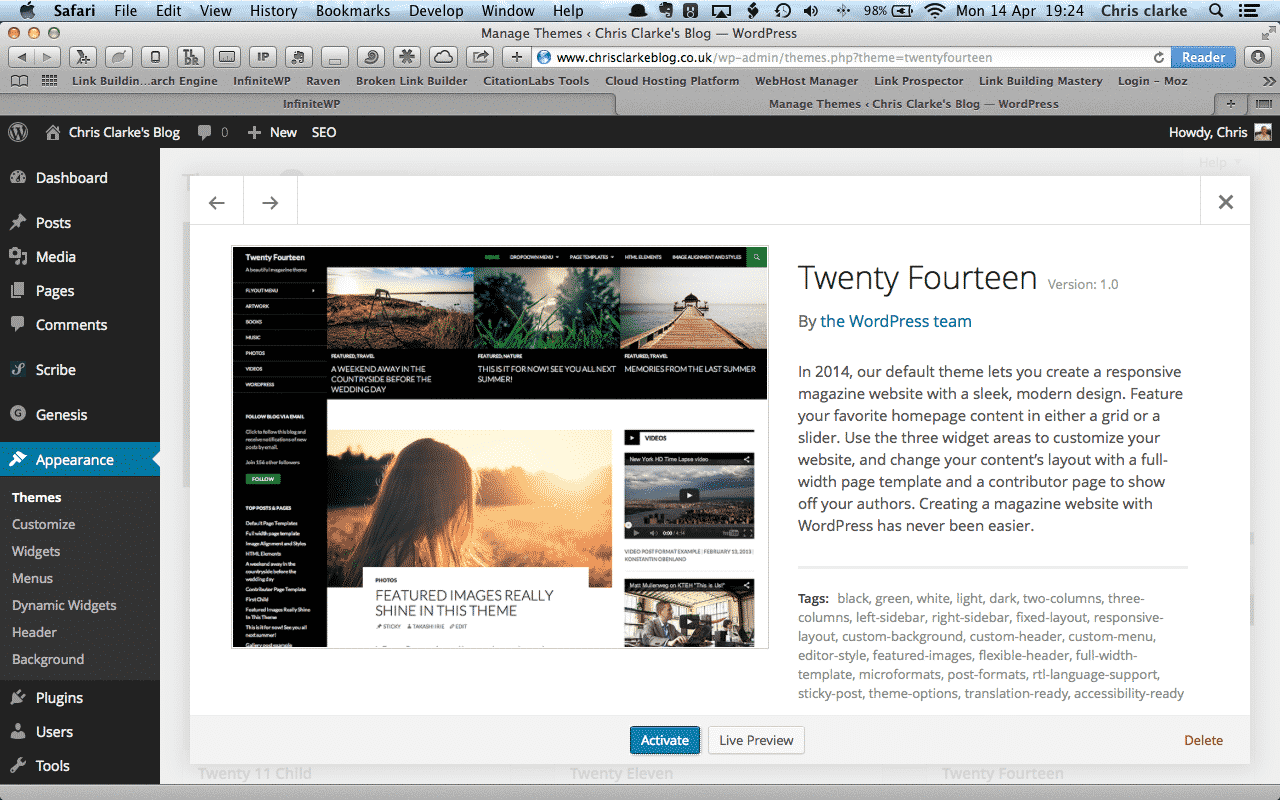
- A new default theme (Twenty Fourteen)
- Refreshed Dashboard (DASH)
- New Theme Selection page (THX38)
- A new admin design (MP6)
All the above have been included in the feature-freeze although final inclusion will depend on testing progress. The new theme may apparently get bumped back a version.
Twenty Fourteen
This looks like one of the most detailed default themes  released to-date, and quite possibly the best magazine-styles available for free. According to wpmu.org there was some doubt during the IRC Meeting whether Twenty Fourteen is ready for release. However it is included in the, beta version and is a magazine-style layout with plenty of premium features, such as:
- A responsive layout
- Featured content area with slider
- Contributors page
There is a fully function Twenty Fourteen demo page available showing off the main features. Whilst it is pitched as a magazine style theme there is plenty of scope to adapt it and use in a varitey of ways.
Refreshed Dashboard
This is the first revamp of the dashboard for quite a while. The new dashboard is super responsive, adapting smoothly to different screen sizes.
The new dashboard appearance is much improved with various WordPress news feeds merged: QuickPress has become QuickDrafts thereby changing the emphasis from post creation to idea curation; and the creation of an Activity Area does away with the Recent Comments section. It is no longer possible to choose the number of columns on the page, but rather the dashboard will adapt to the screen size.
The main visual change is at first subtle but very effective.
New Theme Selection page
Again, the initial impression of the new page is quite subtle. The tabs across the top have gone and been replaced by a grid layout and Hovering over each installed theme presents a very attractive overlay.
The whole experience feels quicker and more responsive and will be welcomed by users of tablets or smaller screened computers.
A New Admin Design
Work on the appearance of the Admin area was included in the plan for WordPress 3.6 but was dropped quite late in the process.
The main points are:
- Improved responsive design
- a new type face
- better spacing
- improved contrast.
Once again the initial impression when loading is quite subtle, with changes being more apparent after switching between themes a few times.
Clicking on a widget now presents a drop-down option to insert it into one of the widget areas.

Feels very intuitive and will be welcomed by users of tablets.
WordPress 3.8 Beta
The beta can be downloaded from the main WordPress.org site, or alternatively, you can try it out by installing the WordPress Beta Tester plugin. Clearly you should never use a beta version on a live production site (unless you really really like trying to fix broken sites).
Personally, I hope that the Twenty Fourteen theme does make it into the final release, it’s a great looking theme with some really cool features and I’m looking forward to working and developing it.


